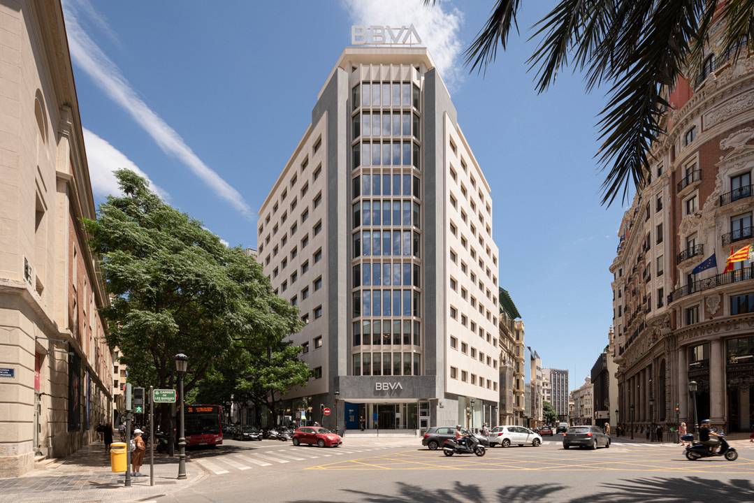
Barcelona, Spain – Miriam Castells Studio has designed this recent refurbishment of the BBVA Bank’s regional headquarters in Valencia. This is an emblematic building in a central area of the city, built in 1965, which has required a comprehensive reform of the facade, reception desk and interior floors.
The intervention has been carried out with the utmost respect for the original elements of the building. On the outside, the premise of quality provided by the original materials has been maintained. Inside, we can find a game of contrasts in textures, colours and materials and a careful selection of furniture. All this to achieve a set of elegance and luminosity, in Valencia, which is called “the city of light” of Spain.
BBVA’s territorial headquarters building in Valencia. Located in the capital’s financial district of the Comunidad Valenciana, Spain.
The 12-storey, 10,250 square metres building was built in 1965 and was originally the Valencia headquarters of Banco Exterior. The bank occupies 7 of the 12 floors, the rest is office space to let.
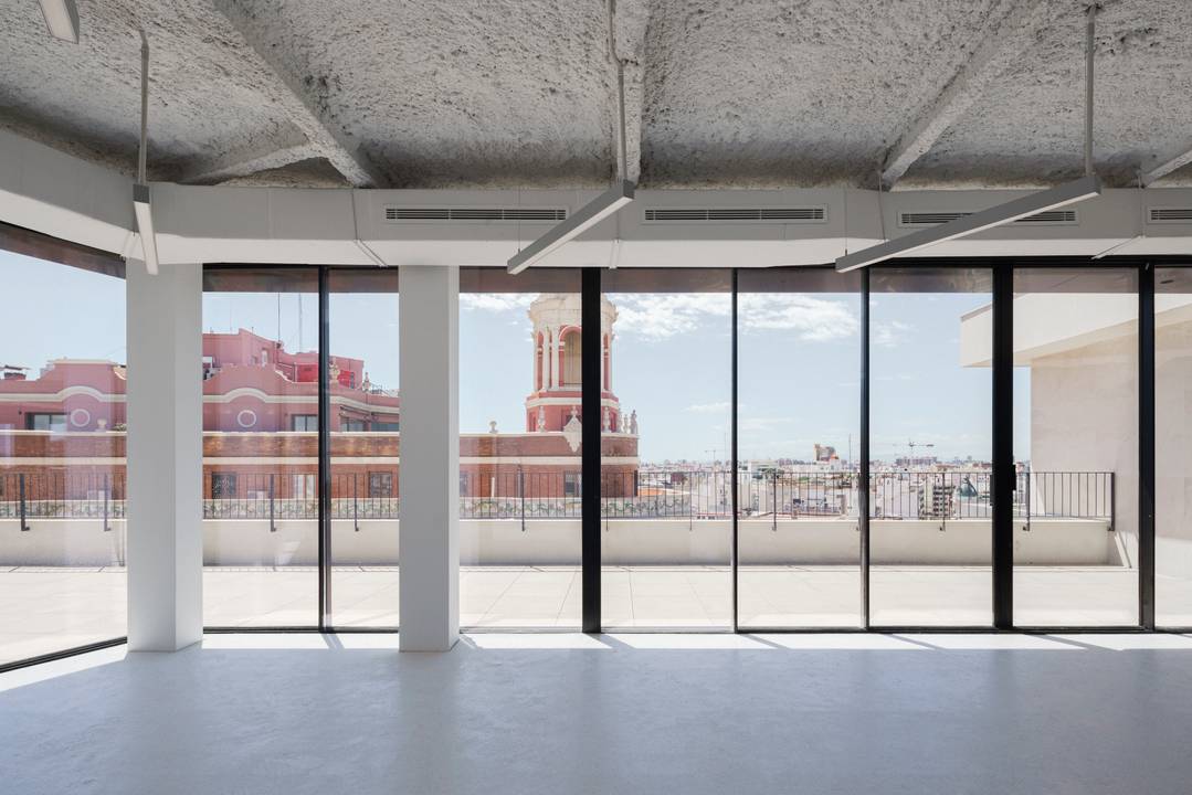
It is a chamfered building, with a mixed concrete and metal structure and diaphanous floors that are easily divisible. With terraces and two main street façades.
Comprehensive refurbishment works are carried out from the façade into the building’s interior.
The façade required a comprehensive but thoughtful refurbishment, not only because of the aging state of its materials, but also because of the complete renovation of all its carpentries. Faced with such programmatic needs, the leitmotiv of the project is based on a thorough respect of the original design essence. It contemplates the replacement of the stone parts by the same material, although with a current system of hidden anchors. The original galvanized carpentries are replaced by large unibody windows. The central body, composed of concrete perimetral frames, is rehabilitated following the same aesthetic conservation criteria mentioned above.
All the concrete frames are cleaned up, recovering the tonality of the material. Regarding the openings of this front façade, the original proportions remain, including the full/empty ratio, and work is done with hidden and fixed frame profiles, in order to guarantee the invisibility of the carpentry.
On the ground floor we proceed to eliminate all the jambs of the old carpentry and opaque façade breastplates, providing great transparency to all the spaces on the ground floor, allowing the interaction of the interiors with pedestrians. This permeability respects the original aesthetics of the building while matching the current functional program.
It should be noted that the original facades’ original composition has endured in the refurbishment project, including respecting all original materials in the entire building, both exterior and interior.
Concrete, limestone and two types of granite made up the façade of the bank. In the refurbishment the materiality of the original façade is maintained: concrete, limestone and only one type of granite shape the building.
The original state of entrance shows a disorderly arrangement of the space, very shadowy that houses at its end a white and black autochthonous marble staircase that marks the concept and materializes into the interior’s project.
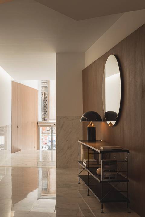
With this as starting point, the rest of the materials, according to use and location, will be intrinsic to the development of the project. Walnut wood is included, which together with the white Ibiza and the black Marquina marbles, constitute a good ally to enhance the 60s decade and revitalize the building’s essence.
In this way, the entrance hall is materialized. The exterior-interior of the building is connected through the black zimbawe granite baseboard and the interior staircase of the same material that leads to the hall. White Ibiza’s marble gives brightness to an entrance that previously lacked light. The counter is made of the same material and is illuminated by Simon’s suspended lamp Slim System by Josep Lluscà. A waiting bench accompanies this area and is illuminated with the Cesta Metálica lamp (1962) by Miguel Milá for Santa & Cole. The walnut cladding houses the cabinets and recessed accesses for the building facilities.
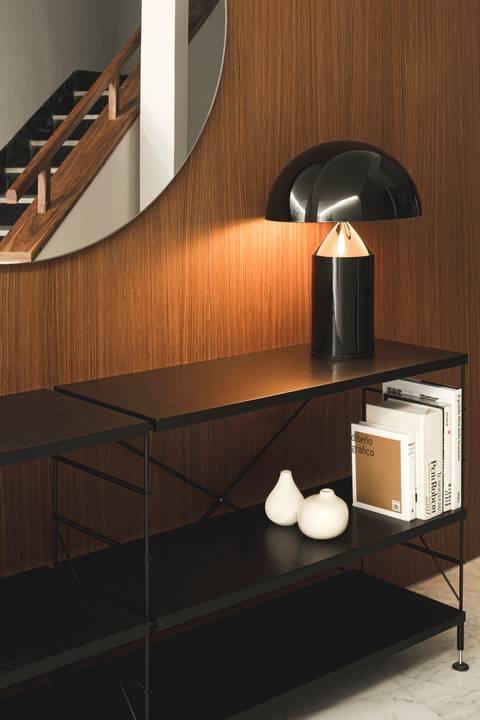
The Ibiza marble corridor and indirect lighting leads to the entrance hall. Walnut cladding, the Tria shelf (1978) by JM Massana and JM Tremoleda by Mobles 114, the Atollo table lamp (1977) by Vico Magistretti de Oluce and a circular mirror conform this space. Facing it is the black-white marble staircase that gives shape to the project.
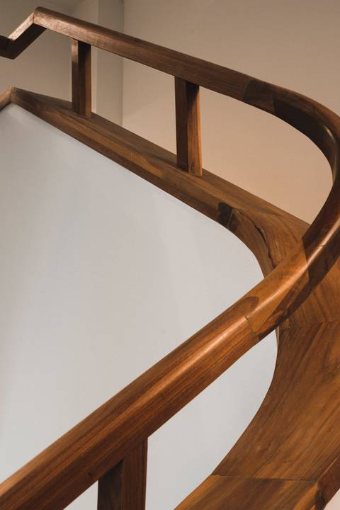
The staircase is restored, and the railing modified. It is made on site and is topped with a walnut wood handrail. The elevator accesses are covered in the same black Marble as they were originally.
The bathrooms are made of porcelain from Mirage, the bathroom sinks are made of Solid Surface by Krion by Porcelanosa, faucets from Water Evolution in stainless steel and walnut dividers. These last are bathed by indirect light in the mirror and with downlights from Com.led.
Accesses to the offices are covered in walnut and illuminated by Com.led rail systems. The building’s top floor recovers office space previously unused, providing it with a diaphanous layout, facilities in plain sight, projected with non-flammable coating material and outdoor terraces with unobstructed views of the whole city.
